Pixel Art Palettes Explained: Game Boy, PICO-8, NES and How to Pick One
What pixel art palettes are and why they matter: Game Boy's 4 greens, PICO-8's 16 colors, NES limits, and how to choose the right palette for sprites, portraits and photos.
Pixel art palettes are the fixed color sets that define the retro look — Game Boy's four greens, PICO-8's sixteen colors, the NES's 54. Working within a small palette is what separates pixel art from a blurry photo: fewer colors force deliberate placement, and the constraint is the aesthetic. This guide covers the classic palettes, what each is good at, and how to apply one to any photo in seconds with a free converter.
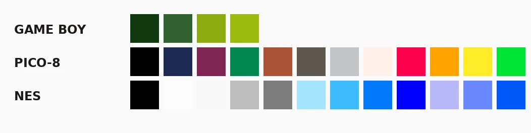
What is a pixel art palette?
A palette is the complete list of colors a piece is allowed to use — historically a hardware limit, now a stylistic choice. Old consoles could only display a handful of colors per sprite, so artists learned to do more with less: shading with fewer steps, implying texture with dithering, picking hues that read clearly at small sizes.
That constraint still pays off today. A 16-color image is instantly recognizable as "retro", stays visually coherent when scaled, and converts cleanly to physical media like perler bead patterns where every color is a bead you have to buy.
Game Boy palette: 4 shades of green
The original 1989 Game Boy screen rendered everything in four greens, and the limitation became one of the most iconic looks in gaming.
#0f380f #306230 #8bac0f #9bbc0f
Use it for: stark high-contrast images, horror pieces, anything that should feel like a Game Boy cartridge. Four colors is brutally minimal — silhouettes, strong shapes and dithering carry the image. Landscapes with sky gradients dither beautifully; detailed portraits turn to mush.
PICO-8 palette: 16 colors, the modern standard
The fantasy console PICO-8 ships a fixed 16-color palette that has become the default for modern retro indie games — Celeste, Balatro and hundreds of game-jam entries use it.
#000000 #1d2b53 #7e2553 #008751 #ab5236 #5f574f #c2c3c7 #fff1e8
#ff004d #ffa300 #ffec27 #00e436 #29adff #83769c #ff77a8 #ffccaa
Use it for: portraits, photos, anything needing skin tones or gradients. Sixteen colors is the sweet spot — enough range for faces and fur, small enough to stay obviously retro. If you're converting a photo and don't know which palette to pick, pick PICO-8.
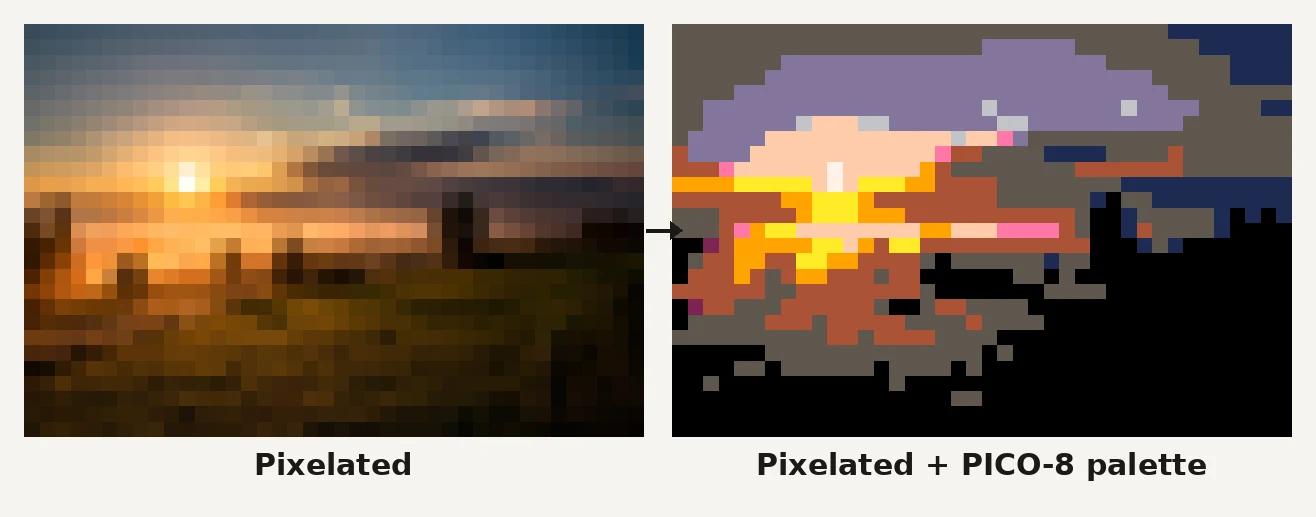
NES palette: 54 colors, the 8-bit ceiling
The Nintendo Entertainment System could display 54 colors (25 on screen at once). The NES palette is punchy and slightly garish — heavy reds, hard blues, that unmistakable 8-bit sky.
Use it for: sprites and scenes that should feel like Mario or Mega Man. It's the least beginner-friendly of the three: more colors means more decisions, and mid-tone gradients are noticeably absent, so shading jumps in steps.
Grayscale palette: the safest conversion
A pure grayscale ramp (black to white in 4–16 steps) sidesteps hue problems entirely. Photos convert to grayscale pixel art with almost no tuning, and the result reads as "intentional" rather than "washed out".
Use it for: architecture, high-contrast portraits, and test runs while you're still deciding on a grid size.
How to choose a palette: quick decision guide
| You're making… | Pick |
|---|---|
| A game sprite | PICO-8 (16) or NES (54) |
| A photo portrait | PICO-8 (16) or grayscale |
| A moody landscape | Game Boy (4) with dithering |
| A bead pattern | Your bead brand's catalog — palettes map to bead colors |
| A logo or icon | Game Boy (4) or grayscale |
Two rules that beat any table: contrast over count (a 4-color palette with strong value separation beats 32 muddy colors), and match the palette to the subject (skin tones need warm hues; night scenes need cool ones).
What is dithering's role in a palette?
Small palettes can't render smooth gradients — the sky jumps from one green to the next. Dithering fills the gap with checkerboard mixtures of neighboring colors, faking intermediate shades the palette doesn't contain.
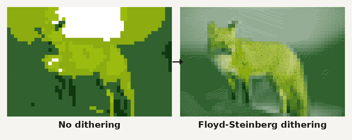
Rule of thumb: dither on for skies, sunsets and skin at 4–16 colors; dither off for crisp icons and anything headed to physical media — scattered single pixels become isolated beads no one can place.
How to apply a palette to a photo
The manual route in Photoshop or GIMP — convert to indexed color, load the palette file, fix the dithering — takes ten-plus steps. The fast route: open the free image to pixel art converter, drop in a photo, and pick Game Boy, PICO-8 or grayscale from the palette dropdown. The conversion runs locally in your browser (no upload), with live preview of palette, grid size and dithering before you export a PNG.
FAQ
What is the best palette for pixel art beginners?
PICO-8's 16 colors. It's expressive enough for any subject, forgiving of imperfect color choices, and the de facto standard in modern retro games — so everything you make with it looks current rather than dated.
How many colors should pixel art have?
Sprites: 4–8. Scenes and portraits: 16. Above ~32 colors the piece stops reading as pixel art and starts reading as a blurry photo. Fewer, deliberately chosen colors is almost always stronger.
Can I make my own palette?
Yes — pick a hue ramp (e.g. 5 blues from dark to light), add one accent color, and keep value contrast high. But starting from proven palettes teaches faster; invent your own once you can predict how a color set will read at 32×32.
Do professional games really limit palettes?
The good ones do. Palette discipline keeps scenes readable and art consistent across a team. Celeste (PICO-8-adjacent), Minit and countless itch.io hits wear small palettes as a badge.
Where do I get palette hex codes?
Lospec hosts thousands of community palettes with hex codes — the image to pixel art tool on this site ships Game Boy, PICO-8 and grayscale built in.
Try palettes on your own photos
Open the free pixel art converter, drop in a photo, and switch between Game Boy, PICO-8 and grayscale on the same image — the difference is bigger than any grid-size change. When you find a look you want on your wall, the bead pattern maker turns that same palette-mapped image into a printable pattern with real bead colors and counts.